Product or SaaS
Branding
Mobile Design
UI/UX
ARC Community – Members-Only Platform
ARC Community – Members-Only Platform
Branding and UI/UX for an exclusive NFT-gated community platform connecting the Global Asian Diaspora.
Branding and UI/UX for an exclusive NFT-gated community platform connecting the Global Asian Diaspora.

Situation
Situation
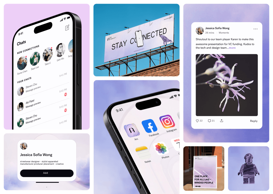
• [Branding] ARC is a members-only community built around the global Asian diaspora, using NFTs as proof of membership. It had no cohesive visual identity, which made it hard to communicate exclusivity, innovation, and trust, and left it looking like a generic Web3 project rather than a premium community. • [Mobile Design] ARC’s earlier product suffered from dated visuals and poor accessibility. It was harder for members to use than it should have been, and it actively undermined the premium brand ARC was trying to project — a real risk for a paid-membership product where usability friction drives churn.
• [Branding] ARC is a members-only community built around the global Asian diaspora, using NFTs as proof of membership. It had no cohesive visual identity, which made it hard to communicate exclusivity, innovation, and trust, and left it looking like a generic Web3 project rather than a premium community. • [Mobile Design] ARC’s earlier product suffered from dated visuals and poor accessibility. It was harder for members to use than it should have been, and it actively undermined the premium brand ARC was trying to project — a real risk for a paid-membership product where usability friction drives churn.
Task
Task
• [Branding] Build a brand system — logo, color, typography, and hero visuals — that would hold up across product, marketing, and investor-facing materials, and clearly differentiate ARC from look-alike Web3 and community platforms. • [Mobile Design] Redesign ARC’s mobile and web UX to be accessible, modern, and brand-aligned, so the team could drive higher engagement and reduce onboarding friction while keeping the product consistent across a growing feature set.
• [Branding] Build a brand system — logo, color, typography, and hero visuals — that would hold up across product, marketing, and investor-facing materials, and clearly differentiate ARC from look-alike Web3 and community platforms. • [Mobile Design] Redesign ARC’s mobile and web UX to be accessible, modern, and brand-aligned, so the team could drive higher engagement and reduce onboarding friction while keeping the product consistent across a growing feature set.
Actions
Actions
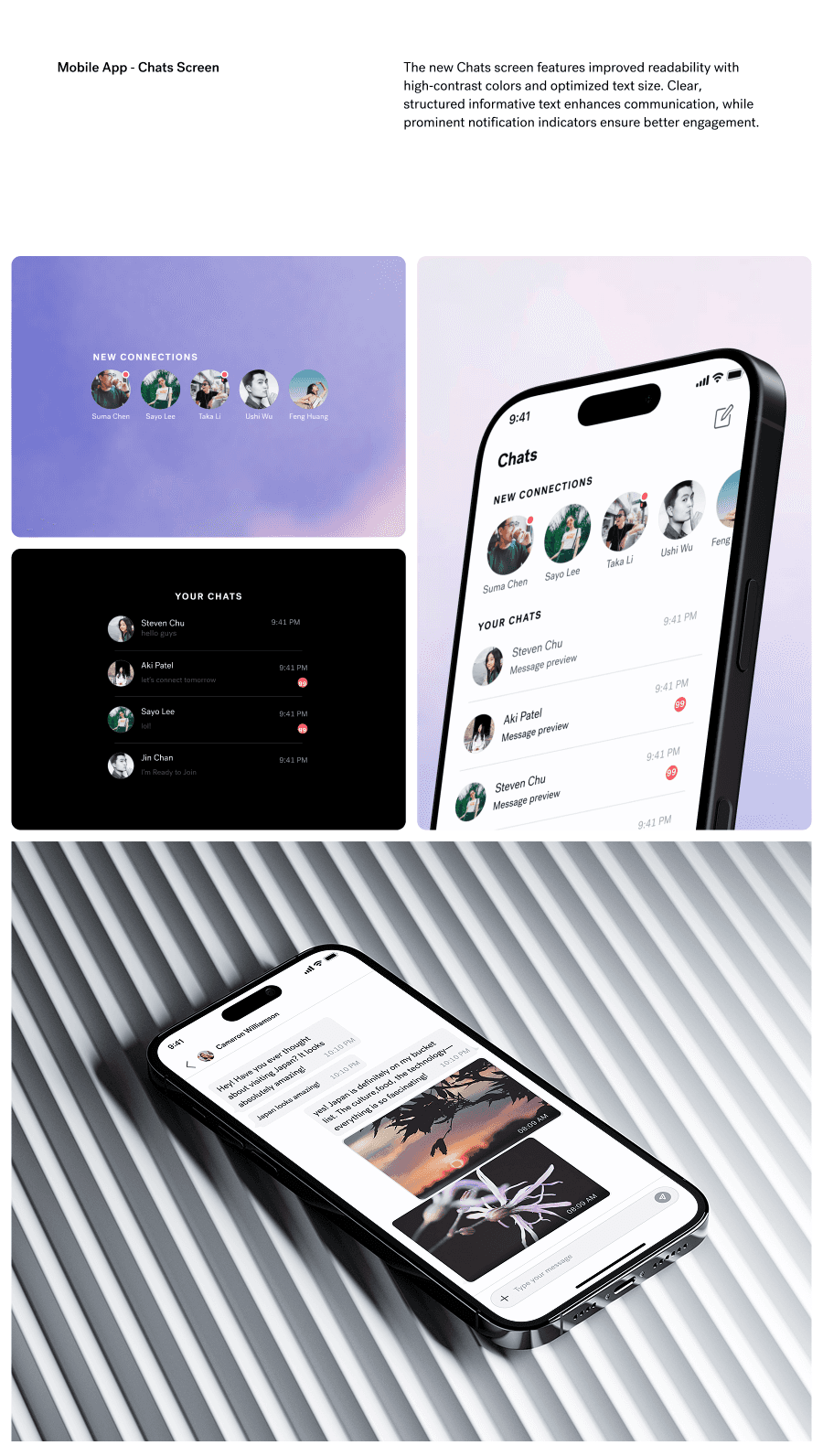
• [Branding] I explored several visual territories before converging on a gradient-driven, minimal identity that could scale from app UI down to decks and social content. I chose restraint over novelty and codified usage rules for type hierarchy, color application, and motion so the team could keep the brand consistent across launches. • [Mobile Design] I audited every core flow against WCAG AA/AAA criteria, restructured navigation and interaction patterns, and rebuilt the interface on an atomic design foundation with accessible contrast, clearer type scale, and consistent action/state patterns. The trade-off was investing up front in tokens and components to stop drift as the product scaled.
• [Branding] I explored several visual territories before converging on a gradient-driven, minimal identity that could scale from app UI down to decks and social content. I chose restraint over novelty and codified usage rules for type hierarchy, color application, and motion so the team could keep the brand consistent across launches. • [Mobile Design] I audited every core flow against WCAG AA/AAA criteria, restructured navigation and interaction patterns, and rebuilt the interface on an atomic design foundation with accessible contrast, clearer type scale, and consistent action/state patterns. The trade-off was investing up front in tokens and components to stop drift as the product scaled.
Results
Results
• [Branding] ARC walked away with a unified brand toolkit that made membership and partnerships easier to pitch, with a clear premium visual story and far fewer inconsistencies across touchpoints. • [Mobile Design] The atomic system reduced UI inconsistencies by 66%, dev handoff effort by 25%, and file-management overhead by 60%. Members got a lower-friction, accessibility-compliant experience, and ARC got a system its team could extend without redesigns.
• [Branding] ARC walked away with a unified brand toolkit that made membership and partnerships easier to pitch, with a clear premium visual story and far fewer inconsistencies across touchpoints. • [Mobile Design] The atomic system reduced UI inconsistencies by 66%, dev handoff effort by 25%, and file-management overhead by 60%. Members got a lower-friction, accessibility-compliant experience, and ARC got a system its team could extend without redesigns.






Conclusion
The redesign successfully transformed the app into a modern and accessible platform that aligns with ARC's vision for community collaboration and innovation across the Global Asian Diaspora.
More projects

ChaiShots — OTT Platform Redesign
A complete UX/UI redesign of ChaiShots, a lifestyle-first OTT platform blending chai culture with short-form storytelling.

Peoplens – The All-in-One Employee Management Platform
A smart HR platform that simplifies workforce management through interactive org charts and data-driven insights.

Bubbles Salon - Redesign website
A seamless minimalist website redesign for a 21-year-old beauty salon brand built for modern digital presence.
ChaiShots — OTT Platform Redesign
A complete UX/UI redesign of ChaiShots, a lifestyle-first OTT platform blending chai culture with short-form storytelling.
Peoplens – The All-in-One Employee Management Platform
A smart HR platform that simplifies workforce management through interactive org charts and data-driven insights.